


How to Match Curtains With Wall Color Like a Pro
Making Sense of Color in Your Actual Home
Let's be real, picking the right curtains to go with your walls can be a bit of a headache. There are so many supposed "rules" floating around! It's easy to get lost down the rabbit hole of Pinterest and design blogs. Honestly, the trick is understanding how color plays out in your own home. I've seen it countless times in Kiwi homes – the same wall color looking totally different depending on the time of day and which way the windows face. That "Resene Alabaster" can have a surprising peachy glow in the afternoon sun!
For example, think about a west-facing room. The afternoon sun warms everything up, even walls painted in cool tones. Pale grey curtains might look washed out in that light, but a richer, slightly warmer grey could look amazing.
Then you've got north-facing rooms. Here in New Zealand, they tend to have a cooler, more consistent light. That opens up opportunities for bolder colors. Imagine a vibrant teal or deep navy against a lighter wall – stunning! Paying attention to these little quirks of your home's natural light is key.
Embrace Your Personal Style
This whole idea of really getting to know your own space ties into a bigger trend in NZ interior design. These days, it's all about creating spaces that feel personal and comfortable. Discover more insights. There's no one-size-fits-all solution when it comes to color. It's about making your home feel truly yours.
So, understanding how light and color dance together in your specific home is the first step. It's how you create a space that's both stylish and authentically Kiwi. From there, you can make choices you feel confident about, choices that really bring out your home’s unique character.
Reading Your Room Like a Design Professional
Before you even think about hitting the shops, let's spend some quality time with your space. I mean really get to know it. It's more than just measurements and square footage. Your room changes throughout the day, bathed in different light, and that's a huge factor in choosing curtains you won't get sick of after a week. Think about it – how does that morning light hit your walls compared to the softer glow of the evening? How do your current furnishings play with the wall color?
Assessing Your Space in Real Time
Honestly, the best thing you can do is spend an afternoon just observing your room. Grab a cuppa, settle in, and watch how the light shifts and dances around, affecting how your wall color appears. I've seen this so many times, especially with west-facing windows (pretty common in NZ homes!). That warm afternoon sun can completely transform a wall color. What you thought was a neutral grey might suddenly reveal warm, honey-colored undertones you never noticed before. Jot down some notes, snap a few photos – these little details will be super helpful later.
Undertones: The Secret Language of Color
And that brings me to undertones. These are the subtle hints of pink, yellow, or green hiding beneath the surface of what might seem like a totally neutral wall. Trust me, they're the key to successfully matching curtains with wall color. A simple trick? Hold a plain piece of white paper up against your wall. The difference between the stark white of the paper and your wall color will reveal its true undertone. This is gold when it comes to choosing curtains that truly complement the space.
For example, let's say your "grey" walls have a green undertone. If you choose a grey curtain with a blue undertone, you'll get this subtle clash, that nagging feeling that something's just a little bit off. But, if you go for a warmer grey curtain, maybe with a hint of brown, it'll probably create a much more harmonious and pleasing effect. By understanding your room’s personality, those subtle nuances, you're well on your way to choosing curtains that truly enhance its natural beauty.
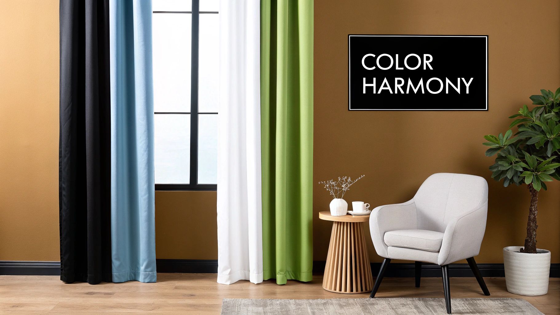
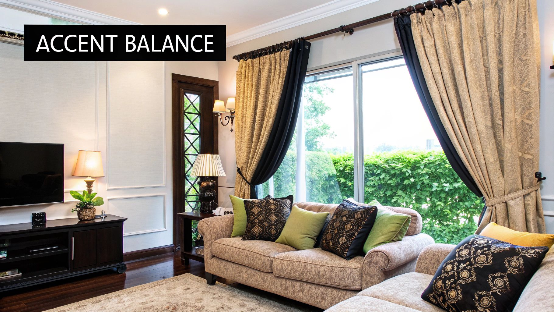
Color Combinations That Actually Sing Together
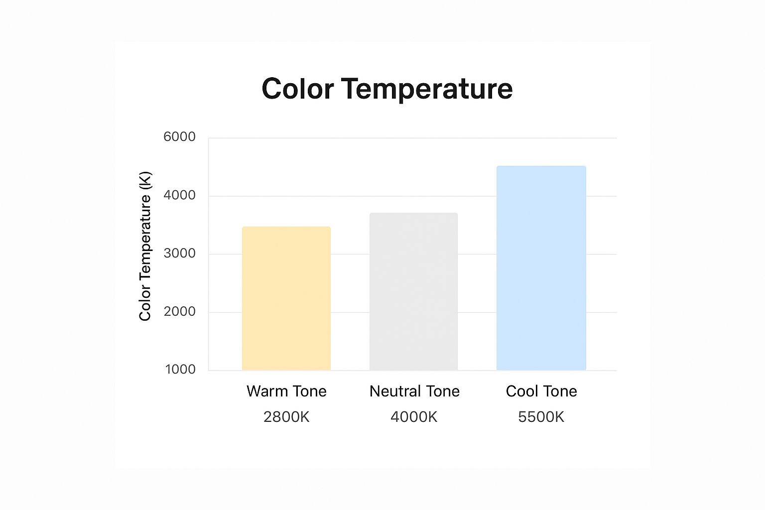
This infographic shows how different lighting temperatures—2800K (warm), 4000K (neutral), and 5500K (cool)—can drastically change how colors appear. The same curtain fabric can look completely different under various light sources! This is a perfect example of why understanding your room's natural light is so important when choosing curtains.
I’ve spent ages playing around with different color combinations in my own home, and let me tell you, lighting makes all the difference.
Let’s dive into some winning color pairings that I’ve seen work wonders in New Zealand homes.
Tried and True Color Pairings
Think about Resene's Half Rice Cake, a hugely popular wall color here in NZ. Because it’s a warm neutral, you could go for curtains in a richer cream for a soft, monochromatic vibe. Or, how about crisp white curtains against that Half Rice Cake backdrop? It's a classic for a reason!
Want something bolder? Earthy tones like olive green or burnt orange can create a really sophisticated contrast. I've seen this done in a friend's living room, and it looks incredible. You can find some other inspiring combos at Maak Home. They have a knack for putting colors together!
Creating Contrast Without Chaos
Another Kiwi favorite, Dulux's Natural White, offers a clean, bright base for your curtains. Subtle greys create a calm and understated elegance, while deep blues or greens add a touch of drama.
Feeling adventurous? A vibrant mustard yellow or a soft blush pink can work surprisingly well with Natural White, adding a pop of personality without being overwhelming.
Embracing Bold Feature Walls
Charcoal accent walls are everywhere right now, and for good reason! To keep the room from feeling too dark, pair them with light, airy curtains. Sheer white linens or a light, silvery grey would do the trick.
If you’re after a more luxurious feel, rich velvet curtains in jewel tones—emerald green or sapphire blue—look amazing against a dark wall. It’s all about that balance of light and dark.
To help visualize some great curtain and wall color combinations, I've put together this handy table:
Popular NZ Wall Colors and Ideal Curtain Matches
A comparison of trending New Zealand wall colors with recommended curtain color families and specific examples.
| Wall Color | Color Family | Recommended Curtain Colors | Style Notes |
|---|---|---|---|
| Resene Half Rice Cake | Warm Neutral | Deeper Cream, Crisp White, Olive Green, Burnt Orange | Monochromatic, Classic, Earthy and Sophisticated |
| Dulux Natural White | Neutral | Subtle Greys, Deep Blues, Greens, Mustard Yellow, Blush Pink | Calm and understated, Dramatic, Adds a pop of personality |
| Charcoal | Dark Neutral | Sheer White, Light Silver Grey, Emerald Green, Sapphire Blue | Prevents room from feeling too dark, Airy, Luxurious |
This table gives you a starting point for your own color journey. Don't be afraid to experiment and find what truly speaks to you! The key is to think about the overall mood you want to create in your space.
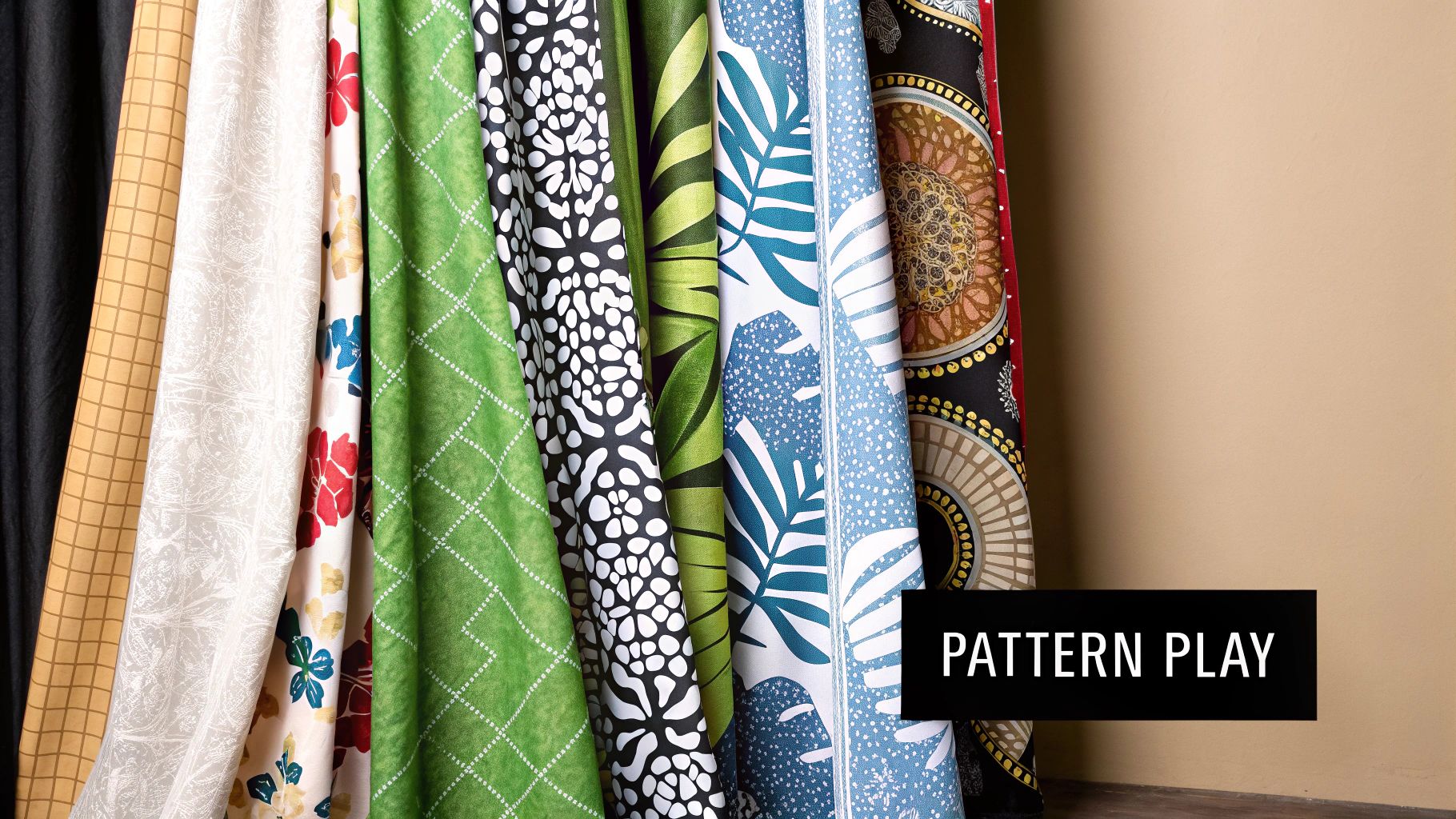
Texture, Pattern, and Fabric Secrets That Matter
So, you've picked your wall color and have a pretty good idea about your curtain colors. Awesome! But matching curtains to your walls goes beyond just color. The right texture and fabric can make a room truly special. Think about how light changes throughout the day. This drastically impacts how fabrics look and feel.
Smooth fabrics like silk or sateen reflect light, making colors pop in bright rooms. But in a dimly lit room, they might not have the same impact. That's where texture comes in. A textured fabric like linen or a chunky weave adds depth and interest in softer light. Linen is also a fantastic sustainable choice, by the way.
Pattern Power: Avoiding Visual Chaos
Adding pattern can be a bit of a tightrope walk. A bold geometric print can be amazing against a plain wall, but too much if your walls are already patterned. If your walls are a single color, patterned curtains can add a much-needed focal point. It's all about finding the right balance.
Weight and Hardware: The Unsung Heroes
Fabric weight is more important than you think. Heavy fabrics like velvet create a luxurious, dramatic feel, perfect for blocking light and insulating a room. Lighter fabrics like linen or cotton give a breezy, casual vibe.
Finally, don't forget the hardware. The right curtain rod and finials can complement your colors, while the wrong ones can clash. Choose finishes that work with your overall design.
Tailoring Your Approach to Each Living Space
Matching curtains to your wall color isn't just about picking a fabric you like – it's about understanding the vibe of each room. A bedroom isn't a kitchen, right? One's for peaceful sleep, the other is buzzing with activity. Let's dive into how this works room by room. You might also find this helpful: Choosing Colours to Match Your Furniture
Living Areas: Creating a Welcoming Vibe
Living areas are all about warmth and encouraging good conversation. Here in New Zealand, we're big on that open, airy feeling. So think light, breezy fabrics in colors that work with your furniture. If you've already got a neutral palette, maybe a subtly patterned curtain could add a touch of personality without being overpowering.
Bedrooms: Tranquility and Rest
In bedrooms, the focus is calm and relaxation. Richer, deeper colors can block out light and create that cozy feeling. If you've got lighter walls, darker curtains can add a touch of drama and even help you sleep better. On the other hand, softer, muted tones can also make a peaceful space for unwinding.
Multipurpose Spaces: Balancing Act
Multipurpose rooms, like a home office, can be trickier. You need a space that's both comfortable and helps you focus. Balance is key here. Bold walls? Go for more neutral curtains. Neutral walls? Maybe a patterned curtain or a splash of color can add some energy and interest. Getting the right balance with your curtains and wall color is a big part of good interior design – it really affects how a room looks and feels. The growing focus on interior design in New Zealand, with a projected 5% CAGR from 2025-2030, really highlights this. Discover more insights. No matter what room you're working with, remember the main goal is to create a space that works for your lifestyle.
Avoiding the Mistakes That Waste Money and Time
Let's chat about dodging those decorating disasters – the ones that can seriously dent your budget and your sanity. We've all been there, right? Splurging on beautiful curtains, only to realize they somehow make the whole room look cheaper. More often than not, the culprit is a sneaky little color matching mistake that seemed perfectly reasonable at the store.
One classic trap is matching everything too perfectly. If your walls are Resene Quarter Tea and you choose curtains in the exact same shade, you're cruising for a flat, uninspired space. It's that dreaded "hotel room" vibe – everything coordinates, but it lacks personality and warmth.
Another common pitfall is forgetting about how light changes throughout the day and across seasons. That "perfect" grey can look completely different bathed in the midday sun compared to the soft glow of evening. This is where having a few different curtain options can be a game changer! Sheer curtains for daytime, heavier drapes for evening – it’s all about flexibility. The interior design industry in New Zealand is booming these days, which tells you a lot about how much people value professional advice when it comes to these tricky details. Want to learn more about this trend?
Rescuing a Color Mismatch
So, what happens when your meticulously planned color scheme just doesn't work in real life? Don't freak out! Before you tear everything down and start over, try experimenting with smaller, less expensive accessories. Think cushions, throws, maybe even a small rug. Playing around with different colors and textures in these smaller items can often bridge the gap between clashing colors or introduce some much-needed contrast.
If you're still feeling lost in the color wilderness, don’t be afraid to ask for a second opinion. A fresh pair of eyes can sometimes spot a simple solution you've completely overlooked. Chat with a friend whose decorating style you admire, or even consider consulting with a local interior designer. Trust me, a little professional guidance can be a worthwhile investment to avoid costly mistakes down the line. Creating a home you love is a journey, not a race!
Let's talk about some common decorating pitfalls and how to fix them. The table below outlines some frequent curtain and wall color coordination mistakes, explains why they don't work, and offers professional solutions along with some quick fixes you can try.
| Common Mistake | Why It Doesn't Work | Professional Solution | Quick Fix |
|---|---|---|---|
| Matching curtains and walls exactly | Creates a flat, uninspired space lacking depth and visual interest. The room can feel bland and lifeless. | Choose curtains that either complement or contrast the wall color, adding layers and dimension. | Introduce contrasting throw pillows, blankets, or rugs to break up the monotony. |
| Ignoring the impact of natural light | Colors can appear drastically different depending on the time of day and the amount of light. What looks good in the store might not work at home. | Test paint and fabric samples in the room at different times of day to see how the light affects them. Consider different curtain weights (sheers vs. drapes) for varying light levels. | Layer lighting with lamps and overhead fixtures to control the ambiance and how colors appear. |
| Overlooking texture and pattern | Even if colors coordinate, a lack of texture can make a room feel sterile and uninviting. | Incorporate different textures through curtains, furniture, and accessories. Consider patterned curtains to add visual interest. | Add textured throws, pillows, and rugs to soften the look and introduce visual depth. |
| Being afraid of contrast | Playing it too safe with neutral colors can result in a boring and unmemorable space. | Use the color wheel to find complementary or contrasting colors that create energy and visual appeal. Don't be afraid to experiment with bolder hues. | Introduce pops of color with artwork, accessories, or a statement piece of furniture. |
Thinking about these common mistakes and the suggested solutions can help you achieve a more balanced and stylish look in your home. Remember, creating a space you love is all about finding what works best for you and your personal style.
Your Practical Path to Perfect Color Coordination
Okay, so we've talked color theory, but how do you actually use it? Forget strict rules. This isn't about being perfect, it's about finding what you love and creating a space that reflects your style. We're aiming for a flexible approach that works with your real life, budget, and tastes—a room you'll adore for years to come.
A Realistic Roadmap for Success
Think of choosing curtains like a journey. We start with inspiration, then explore colors, and finally, hang those gorgeous drapes. It's not about rigid steps, but more like checking in with yourself along the way to avoid those "oops" moments (and save some money!).
For instance, before you even think about fabric, grab a notebook and spend some time watching how the light changes in your room. Seriously. How does your wall color look at sunrise? Midday? With the lamps on? Trust me, this simple step can prevent major headaches down the road.
Timelines and Expert Advice
Whether you're just refreshing a room or doing a full-on reno, a realistic timeline keeps things sane. A quick update might be a weekend project, while a total room makeover could take several weeks. Be kind to yourself!
Sometimes, a little expert help is a lifesaver. If you’re feeling lost in a sea of swatches, a quick chat with a local interior designer can provide amazing insights and prevent expensive mistakes. That said, if you’re feeling confident and have a clear vision, go for it! Trust your gut.
Making Confident Decisions
Ultimately, it's about creating a space that makes you happy. To get there, we'll focus on practical tools: documenting your choices, testing combinations in your actual room (lighting matters!), and finally, making those decisions with confidence. No more second-guessing!
Remember, creating a home you truly love is an ongoing process. It’s all about finding joy in the details and letting your personality shine through.
Ready to dive in? Check out the beautiful, sustainable curtains, fabrics, and wallpapers at Maak Home. They’re a New Zealand company with a great focus on sustainable practices—a big plus in my book! You might just find the perfect finishing touch for your dream space.


